Minimalism has become the dominant paradigm in web design, yet it remains widely misunderstood as mere aesthetic preference. In reality, minimal design represents a fundamental shift in how digital experiences prioritize human cognition, environmental responsibility, and business performance. This evolution stems not from trend cycles but from quantifiable user behavior, measurable business outcomes, and the technical demands of modern digital infrastructure.
What is Minimal Design?
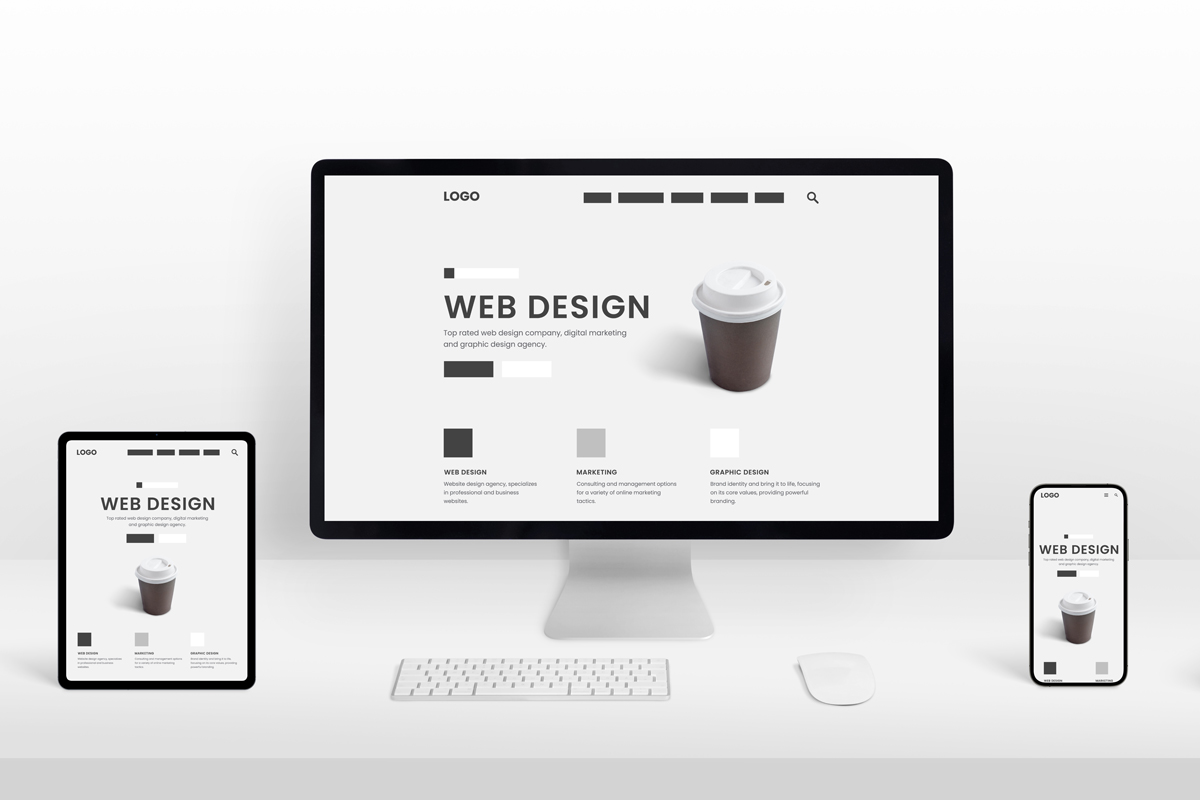
At its core, minimalism in web design is a disciplined philosophy that treats every visual element as a purposeful contributor to user outcomes. Rather than stripping away beauty, minimalism redefines beauty as the clarity that emerges when only essential elements remain. This approach centers on five interconnected principles.
Simplicity and Essential Elements: Every component—from typography to interactive buttons—must serve a clear function. Designers ruthlessly eliminate decorative flourishes, unnecessary animations, and redundant navigation options that add cognitive friction without adding value.
Whitespace as Functional Asset: Negative space isn’t emptiness; it’s intentional breathing room that directs attention and enhances readability. Whitespace groups related content, separates competing ideas, and allows the brain to process information without fatigue.
Visual Hierarchy Through Restraint: Minimalism achieves clarity through deliberate manipulation of typography, spacing, and color. Large, bold headlines command attention naturally. Limited color palettes—often monochromatic with a single accent—ensure focal points emerge without visual competition.
Limited Color and Typography: Most minimalist designs rely on restricted palettes: black-and-white foundations with a single vibrant accent color for call-to-action elements. Typography typically features clean sans-serif fonts (Helvetica, Avenir) in generous sizing with ample line spacing.
Responsive Grid Systems: Underlying minimalist layouts are invisible but rigorous grid structures that maintain visual harmony and ensure content adapts seamlessly across devices.
The Business Case: Quantified Impact
The dominance of minimalism on the web isn’t aspirational—it’s driven by concrete business metrics that have proven repeatable across industries.
Minimalist design directly increases conversion rates. Research from the Nielsen Norman Group demonstrates that clean web design increases conversion and user engagement by up to 67% compared to cluttered interfaces. E-commerce platforms specifically report 35% increases in sales conversion, while lead-generation sites capture 42% more qualified leads. Email campaigns using minimal design see 28% higher open rates, and social media engagement jumps 51% when content employs minimalist principles.
Performance improvements create a multiplier effect. Google’s web performance research shows that minimalist websites load 47% faster on average—a critical advantage since a one-second delay in page load reduces conversions by approximately 7%. Fewer visual elements mean less bandwidth consumption, lower server load, and faster time-to-interactive metrics. These technical improvements translate directly to better search engine rankings, as Google explicitly weights page speed as a ranking factor. Mobile performance scores improve by 89% in minimalist designs, crucial as 59% of web traffic now originates from mobile devices.
Engagement metrics reveal the psychological underpinning. Websites with minimalist designs exhibit 20-30% longer session durations and 35% higher user engagement rates compared to complex counterparts. Bounce rates drop by 25%, indicating visitors remain on-site longer and explore more deeply. This extended engagement signals to search algorithms that content is relevant, creating a virtuous cycle where minimalism improves both immediate conversion and long-term organic visibility.
The conversion advantage operates through a psychological mechanism: reduction of cognitive load. When users encounter cluttered interfaces with competing visual elements, they experience decision fatigue—a mental exhaustion that triggers abandonment. Research in cognitive load theory shows that the brain processes simple design elements 30% more efficiently than complex ones. Task completion times improve 35% in minimal interfaces compared to cluttered versions. Every unnecessary button, color, or animation forces the user’s brain to evaluate relevance, consuming mental resources that should focus on the primary task.
Why Minimalism Dominates in 2026
The convergence of technical, behavioral, and environmental factors has made minimalism not just a preference but a requirement for competitive web presence.
Mobile-First Reality: Google’s shift to mobile-first indexing means responsive design excellence determines ranking. Minimalism naturally adapts to constrained mobile screens—there’s no room for decorative excess on a 5-inch viewport. The philosophy that works for mobile (simplicity, clear hierarchy, fast loading) becomes the foundation for all screen sizes. As mobile usage continues climbing, any design philosophy that penalizes small-screen experiences faces algorithmic obsolescence.
Performance as Brand Promise: Users now perceive speed as a brand attribute. A slow website signals carelessness or poor resource management. Minimalist sites—with fewer HTTP requests, compressed images, and streamlined code—inherently load faster, signaling competence and respect for user time. This isn’t about aesthetics; it’s about user trust.
Cognitive Overload in the Information Age: The average person encounters over 10,000 brand messages daily. In response, users have developed refined filters; they gravitate toward interfaces that don’t demand mental taxation. Minimalism provides sanctuary from visual noise. As digital well-being gains consumer consciousness, users actively prefer designs that respect their attention. Brands perceived as “calm” and “intentional” (hallmarks of minimalism) report higher loyalty and lifetime value.
Accessibility and Inclusivity: Minimalist design principles align precisely with web accessibility standards (WCAG). High contrast, clear hierarchy, generous spacing, and simple navigation benefit not only users with visual or cognitive impairments but improve usability universally. As legal requirements around accessibility tighten and as audiences demand ethical design, minimalism emerges as the design framework that scales inclusivity.
Environmental Consciousness: Digital infrastructure accounts for approximately 2-3% of global carbon emissions—equivalent to aviation. Minimalist websites reduce this footprint through lower data transfer, fewer server requests, and reduced processing power. Studies show 42% CO₂ reduction across optimized minimalist sites. As consumers increasingly demand sustainability from brands, digital footprint becomes a competitive differentiator. Companies aligning design with environmental values appeal to the growing demographic of conscious consumers.
SEO Integration: Minimalism doesn’t just create better user experiences—it aligns with SEO fundamentals. Fast-loading sites rank higher. Mobile-responsive designs get preference. Clean code architecture helps search engines crawl and index content more effectively. Simple navigation structures create logical site hierarchies that search algorithms reward. Clear visual hierarchy ensures that critical content gets semantic emphasis. In short, the design philosophy that users prefer is also the philosophy that search algorithms reward.
Core Design Elements in Practice
The mechanics of minimalism involve orchestrating five core elements to work in concert.
Whitespace Strategy: Apple’s product pages exemplify whitespace mastery. Large product imagery is surrounded by breathing room, forcing the eye toward what matters. Whitespace isn’t neglect—it’s aggressive curation. Each margin, each gap between sections, is calculated. Proper whitespace improves reading comprehension, reduces perceived cognitive load, and guides visual flow almost subconsciously. Research shows that adequate whitespace around text increases comprehension by up to 20%.
Typography as Hierarchy: Instead of relying on color or decorative flourishes, minimalist designers use typography to create visual order. A bold 48px headline naturally commands attention. Secondary information in 16px regular weight recedes. Tertiary details in 12px gray become scannable but unobtrusive. This hierarchy emerges from structure alone, not decoration.
Limited Color Palettes: High-contrast color systems dominate minimalist 2026 design. Black-and-white foundations with a single accent color create immediate visual clarity. The accent color becomes almost impossible to ignore—perfect for call-to-action buttons. Monochromatic color schemes reduce the cognitive load of color decision-making; users don’t evaluate dozens of hues, they evaluate content and one critical action.
Micro-interactions with Purpose: Minimalism doesn’t reject animation; it rejects decorative animation. Motion in 2026 serves specific functions: confirming form submission, indicating loading states, guiding attention to key elements. Each animation answers a question or reduces friction. Purposeless animation wastes bandwidth and becomes annoying at scale.
Performance-First Architecture: Behind every minimalist interface lies lean code. Fewer third-party scripts mean faster loads. Optimized images (WebP format, lazy loading) mean less data transfer. Simplified CSS and JavaScript mean faster rendering. This technical discipline is invisible to users but essential to the speed advantage minimalism delivers.
The Evolution: Minimalism Isn’t Static
A critical misconception is that minimalism is being displaced. It’s not—it’s evolving.
Warm Minimalism Ascending: The sterile, cold aesthetic of early minimalism—stark white backgrounds, pure black text—is softening. In 2026, minimalism embraces warmth: creamy beiges, natural wood tones, subtle textures that feel handcrafted rather than sterile. This “humanized minimalism” preserves the cognitive and performance benefits of simplicity while adding emotional resonance. A minimal page doesn’t feel cold when typography feels generously spaced, colors feel natural, and imagery feels genuine.
Neo-Skeuomorphism Reemerging Thoughtfully: Design trends cycle, and subtle realism is returning—but not the glossy buttons and fake leather textures of early skeuomorphism. Neo-skeuomorphism introduces soft shadows, subtle elevation, and gentle depth cues to improve clarity, not decoration. AI-driven interfaces demand stronger visual signals to convey causality and state change. A button that appears “raised” communicates “interactive” more intuitively than a flat shape. This evolution represents functionality enhancement, not aesthetic reversal.
Minimal Maximalism Blending: Forward-thinking designers are blending minimalist structure with maximalist warmth. Clean layouts and whitespace remain, but rich textures, handmade objects, and curated layers add personality. The result is simplicity that feels human—stripped of excess but not stripped of humanity.
Real-World Implementation
The most successful minimalist websites share observable patterns.
Spotify eliminates all friction between user intent and action. The homepage contains a search bar (singular focus), a call-to-action button, and high-quality imagery. No competing navigation, no sidebar distractions. The interface forces users toward their goal.
Apple’s product ecosystem represents minimalism’s apotheosis for commercial design. Product pages feature large hero imagery with minimal text, ample whitespace, and a single primary call-to-action (typically “Buy”). Secondary information appears below the fold, organized in modular blocks with consistent spacing. Mobile versions eliminate non-essential information entirely, forcing true content prioritization.
IKEA’s website employs Scandinavian minimalism: simple grid layouts, mild earth-tone colors, ample whitespace, and product imagery given prominent space. Navigation is intuitive because there’s nothing extraneous to confuse the user’s mental model.
Figma’s design system demonstrates how minimalism supports brand identity. Light, organized layouts and simple illustrations reinforce Figma’s positioning as a tools company (not a design bureau). Every element serves function—supporting collaboration, innovation, and accessibility.
| Website | Key Minimalist Element | Business Outcome |
|---|---|---|
| Spotify | Single-purpose homepage | High sign-up conversion |
| Apple | Large imagery + whitespace | Premium brand perception |
| Dropbox | Clean layout + mild colors | Easy feature comprehension |
| Figma | Functional design alignment | Brand trust and adoption |
| Muji | Honest simplicity aesthetic | Reinforced brand values |
The Sustainability Dimension
An underappreciated advantage of minimalism is environmental impact. Websites with fewer elements, optimized images, and streamlined code consume less electricity to serve and less bandwidth for users to access. Studies quantify this: minimalist websites reduce CO₂ emissions by 42% on average compared to typical sites. This advantage compounds at scale—a popular website serving millions of requests annually can reduce its carbon footprint by tons of CO₂ through minimalist principles.
For brands committed to sustainability, minimalist design becomes a material expression of values. Patagonia, Everlane, and Allbirds—all sustainability-conscious brands—employ minimalist web design that reduces their digital emissions while communicating their philosophy authentically.
Challenges and Limitations
Minimalism is not universally appropriate or easy to execute.
Communicative Minimalism: Complex products with numerous features face a genuine challenge: how do you convey rich functionality without complex interfaces? The answer is progressive disclosure—revealing advanced features only when users seek them—but this requires sophisticated information architecture and user research.
Cultural and Industry Variation: Minimalism reflects Western, particularly Scandinavian and Swiss design traditions. Markets with different cultural aesthetics (maximalist, ornamental styles in some Asian and Latin American contexts) may resist pure minimalism. Smart designers adapt minimalist principles rather than imposing them dogmatically.
Accessibility Paradoxes: While minimalism generally aids accessibility, poorly executed minimalism creates contrast or interaction problems. Soft gray text on white backgrounds, for instance, violates accessibility standards despite appearing “minimal.” Minimalism requires rigorous attention to color contrast ratios, touch target sizes, and fallback states.
Development Discipline: Minimalist interfaces demand more design rigor and development discipline than “kitchen sink” designs. It’s easier to add features than to remove them; it’s harder to achieve simplicity. Teams must maintain strong design systems and resist feature creep.
The Future: 2026 and Beyond
Minimalism is not the final destination of design evolution—it’s the foundational platform for what comes next.
AI-Driven Personalization Meets Minimalism: As interfaces become context-aware and AI-moderated, minimalism provides the clarity users need to understand system intelligence. A minimalist interface that adapts based on user behavior communicates change clearly through intentional micro-interactions and depth cues.
Spatial and Voice Design: As AR, VR, and voice interfaces proliferate, minimalist principles scale beyond 2D screens. Spatial design fundamentals (clear hierarchy, purposeful elements, reduced cognitive load) apply in three-dimensional spaces. Voice interfaces inherently embody minimalism—the simplest possible interface—and minimalist visual design will support voice interactions.
Ethical Design as Standard: The 2026 design conversation increasingly centers on user well-being, sustainability, and authenticity. Minimalism—which reduces addictive patterns, respects user attention, and minimizes environmental impact—aligns with this ethical imperative.
Emotional Minimalism: The coldest criticism of minimalism—that it feels sterile—is being answered by a new generation of designers who preserve simplicity while restoring warmth. Texture, organic typography, gentle color gradients, and authentic imagery bring humanity to minimalist structure.
Conclusion
Minimalism has taken over the web not because it’s trendy but because it solves real problems: it improves user outcomes (35% higher conversions), enhances performance (47% faster load times), reduces cognitive fatigue, improves accessibility, and aligns with sustainability imperatives. The philosophy that emerged from 1960s art movements and 1920s Bauhaus principles has become the practical language of effective digital design.
The dominance of minimalism in 2026 reflects a maturation of web design toward user-centered, performance-obsessed, and ethically grounded practices. Rather than fading, minimalism is evolving—warmer, more humanized, more emotionally intelligent—while retaining its core power: the clarity that comes when every element serves purpose and nothing serves excess.
For designers, developers, and business leaders, the implication is clear: minimalism isn’t a design option or aesthetic preference—it’s the framework for building digital experiences that users prefer, that search engines reward, and that businesses can sustain profitably.