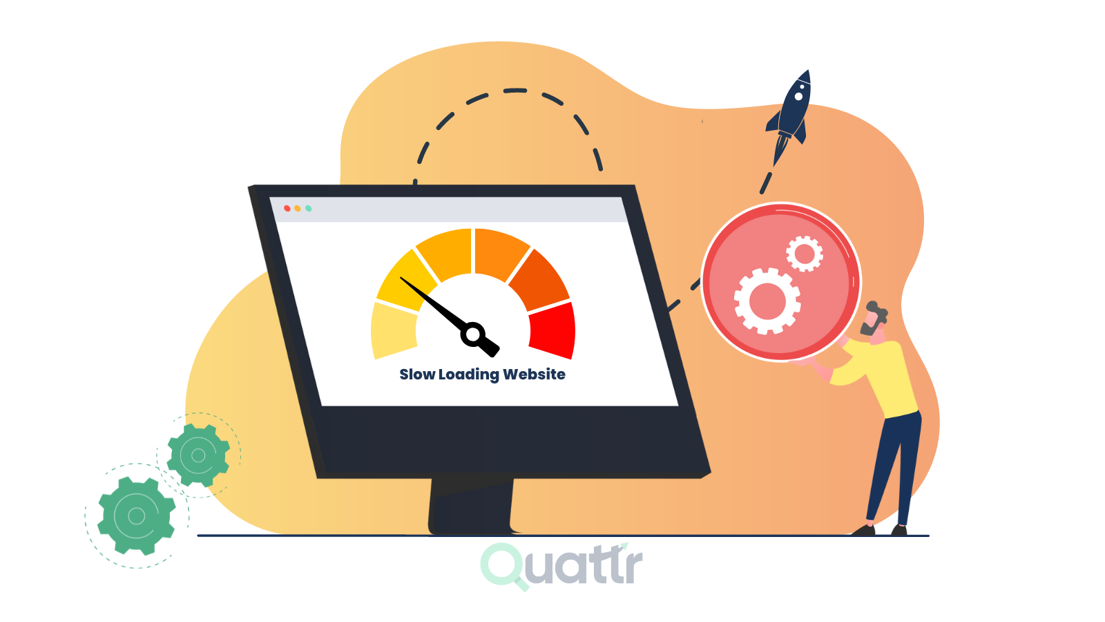
The false dichotomy between visual design and website speed persists in 2026, yet it’s demonstrably false. The fastest websites aren’t necessarily the plainest—they’re the most thoughtfully optimized. Stripe’s visually rich homepage loads in under 2 seconds. GitHub’s cinematic 3D effects feel instant. The distinction isn’t between beautiful and fast; it’s between intentionally optimized and haphazardly bloated. Understanding optimization techniques reveals that design excellence and performance excellence reinforce rather than compete.
The Mindset Shift: Design Decisions Have Performance Costs
The foundation of balancing aesthetics and speed is acknowledging that every visual element carries a cost. A beautiful custom font adds ~100KB. A parallax video background adds significant JavaScript. A complex animation consumes GPU resources. High-resolution hero imagery without optimization adds hundreds of kilobytes.
The goal isn’t eliminating these elements—it’s understanding their cost and making intentional decisions. Rather than removing visual richness, the optimization question becomes: “Is this visual element worth its performance cost? Can I achieve similar visual impact with lower cost?”
Best practice: Establish performance budgets early. Before design begins, define constraints:
- Maximum page size: 2-3MB (target: 1.5MB)
- Maximum critical resources: 5-10 items
- Target LCP: ≤ 2.5 seconds
- Target INP: ≤ 200ms
These constraints force design decisions within performance realities, preventing post-launch conflicts between design ambitions and performance requirements.
1. Image Optimization: Maintaining Quality While Reducing Size
Images are typically the largest assets on websites (often 50-80% of page weight). Strategic image optimization delivers dramatic speed improvements while maintaining visual quality.
Modern Image Formats: The 70% Size Reduction
Upgrading image formats is the single highest-ROI optimization:
- JPEG: Legacy format, inefficient compression (~5-8% of total page weight reduction)
- WebP: Google’s format, 25-35% smaller than JPEG with comparable quality
- AVIF: Next-generation format, 50-70% smaller than JPEG
- PNG: For images requiring transparency or exact detail preservation
- SVG: Vector format for logos, icons, geometric shapes (scalable, no quality loss)
- JPEG XL: Professional format offering best-in-class compression, emerging in 2026
The implementation: Serve multiple formats using <picture> element with fallbacks. Modern browsers automatically select the format they support:
<picture>
  <source srcset="image.avif" type="image/avif">
  <source srcset="image.webp" type="image/webp">
  <img src="image.jpg" alt="description">
</picture>
Result: 70% file size reduction for identical visual quality.
Responsive Images: Serving Right-Sized Images
Serving a 2000px desktop image to mobile users is wasteful. Responsive images use srcset to serve appropriately sized images per device:
<img
  src="image-small.jpg"
  srcset="image-small.jpg 480w,
          image-medium.jpg 800w,
          image-large.jpg 1200w"
  sizes="(max-width: 480px) 100vw, 800px"
  alt="description"
>
Mobile users receive images optimized for their screen size; desktop users receive higher-resolution versions. Combined with modern formats, this can reduce image payload 80%+.
Compression: Lossless vs. Lossy
Compression algorithms reduce file size without (lossless) or with minimal (lossy) visual degradation:
- Lossless compression (PNG, WebP): All original image data preserved; 10-30% reduction
- Lossy compression (JPEG, WebP): Some data discarded; 50-70% reduction while maintaining visual quality
Tools like TinyPNG, Squoosh, and Kraken.io automatically optimize images. The key: Lossy compression targeting 75-85% quality produces imperceptible degradation while achieving massive file size reduction.
Lazy Loading: Load Images Only When Visible
Lazy loading defers image loading until they approach the viewport, prioritizing visible content:
<img src="image.jpg" loading="lazy" alt="description">
Critical rule: Lazy load only off-screen images. Images visible on initial page load (above-the-fold, especially LCP candidates) must eager-load to maintain fast initial rendering.
Lazy loading saves bandwidth and improves LCP by preventing off-screen images from competing for network bandwidth with critical content.
Layout Shift Prevention: Always specify image dimensions using width and height attributes or CSS aspect-ratio, preventing layout shifts as images load.
2. Animation Optimization: Creating Visual Delight Without Performance Penalty
Animations and transitions add visual sophistication and guide user attention. Poorly optimized animations destroy performance; well-optimized animations enhance both aesthetics and functionality.
GPU-Accelerated CSS: Offloading Work from CPU
CPU-bound animation properties (changing width, height, top, left) trigger expensive layout recalculations and repaints. GPU-accelerated properties (transform, opacity) skip these expensive operations:
CPU-intensive (avoid for animation):
css.box {
  animation: move 1s infinite;
}
@keyframes move {
  from { left: 0; }
  to { left: 100px; }
}
/* Triggers reflow + repaint each frame */
GPU-accelerated (optimal):
css.box {
  animation: move 1s infinite;
}
@keyframes move {
  from { transform: translateX(0); }
  to { transform: translateX(100px); }
}
/* Uses GPU, no reflow/repaint */
GPU acceleration enables 60fps animations while keeping main thread free for interactivity.
Animatable GPU properties:
transform(translate, rotate, scale, skew)opacityfilterwill-changeCSS property (hints browser about upcoming animations)
Purpose-Driven Animation
95%+ of animations should serve UX purpose—confirming interaction, guiding attention, providing feedback. Decorative animations that don’t enhance usability waste performance budget.
Examples of purposeful animations:
- Hover effects confirming buttons are interactive
- Loading spinners showing progress
- Form validation checkmarks reducing error anxiety
- Smooth transitions guiding attention flow
Decorative animations to avoid:
- Aimless slide-ins/fade-outs without purpose
- Continuous movement (bouncing, pulsing) not indicating state
- Complex particle effects that distract from content
CSS vs. JavaScript Animation
CSS animations (transform, opacity) are GPU-accelerated and perform better than JavaScript animations.
css/* CSS: GPU-accelerated, performant */
@keyframes slide {
  from { transform: translateX(0); }
  to { transform: translateX(100px); }
}

.element { animation: slide 0.3s ease-out; }
javascript// JavaScript: CPU-bound, slower
let x = 0;
function animate() {
  x += 1;
  element.style.left = x + 'px';
  requestAnimationFrame(animate);
}
animate();
CSS animations are preferable; JavaScript animations only when CSS can’t achieve the effect.
Video Instead of GIF
Animated GIFs are inefficient (often 5-20MB for short clips). Modern video formats (MP4, WebM) compress identically animated content 10-50x smaller:
<!-- Inefficient GIF -->
<img src="animation.gif"> <!-- 15MB -->

<!-- Optimized video -->
<video autoplay muted loop playsinline>
  <source src="animation.mp4" type="video/mp4">
  <source src="animation.webm" type="video/webm">
</video> <!-- 0.5-1MB -->
The visual result appears identical; the performance difference is dramatic.
3. Font Optimization: Custom Fonts Without Performance Penalty
Custom fonts express brand identity but can significantly slow load times. Optimization techniques maintain visual brand expression while protecting performance.
Font Subsetting
Fonts include characters for all languages and special characters. Websites using only English need only English characters. Font subsetting removes unused characters:
Before subsetting: 800KB
After subsetting (English only): 150KB
Many modern font services (Google Fonts, Adobe Fonts) automatically subset fonts.
Font Loading Strategy
Different loading strategies balance FOUT (Flash of Unstyled Text) vs. FOIT (Flash of Invisible Text):
@font-face {
  font-family: 'CustomFont';
  font-display: swap; /* Show fallback immediately, swap when custom loads */
  src: url('font.woff2') format('woff2');
}
font-display values:
auto: Browser decides (not recommended)block: Invisible text until font loads (can exceed 3 seconds)swap: Show fallback immediately, swap when ready (recommended for most)fallback: Show fallback, brief period to swapoptional: Use fallback if font loads slowly (recommended for branding)
Font Subsetting and Format
Modern formats (WOFF2, WOFF) compress fonts 50%+ better than TTF:
- TTF: 500KB (legacy)
- WOFF: 300KB
- WOFF2: 200KB (50% smaller than TTF)
Use WOFF2 as primary, WOFF as fallback.
Variable Fonts
Instead of separate files for each weight/style (Regular, Bold, Italic, Bold-Italic), variable fonts include all weights/styles in one file, often smaller than individual weight files:
One variable font file (800KB) includes: Regular, Medium, Bold, Black, Italic, Bold-Italic
Equivalent separate fonts: 5 files × 300KB = 1.5MB
Variable fonts reduce font loading overhead by 40-50%.
4. Critical Rendering Path Optimization: Prioritizing Visible Content
The critical rendering path is the sequence of steps the browser takes to convert HTML/CSS/JS into visible page. Optimizing this path improves perceived performance and actual speed.
Inlining Critical CSS
CSS blocking rendering means the browser waits for all CSS to load before painting. Inlining critical CSS (styles for above-the-fold content) in HTML <head> eliminates this delay:
<head>
  <style>
    /* Critical CSS for above-the-fold content */
    header { ... }
    hero { ... }
    nav { ... }
  </style>
</head>
<body>
  <!-- HTML -->
</body>
Non-critical CSS loads asynchronously, not blocking rendering.
Deferring Non-Critical JavaScript
JavaScript blocks rendering. Only essential scripts should load before rendering:
<!-- Essential scripts: parsing HTML, critical functionality -->
<script src="essential.js"></script>

<!-- Non-critical: defer until after rendering -->
<script src="analytics.js" defer></script>
<script src="chatbot.js" defer></script>
<script src="ads.js" async></script>
defer: Load asynchronously, execute after HTML parsingasync: Load and execute immediately when available (for independent scripts)
Minimizing DOM Size
Large DOMs slow layout and interaction. Target < 1,500 DOM nodes, maximum depth 32 levels, no parent with >60 children.
Large DOMs arise from:
- Repeated HTML templates (carousels with 100 slides)
- Unremoved hidden elements (CSS display:none still counts)
- Infinite scroll implementations loading thousands of items
Solutions:
- Virtual scrolling (render only visible items)
- Pagination (limit initial items)
- Code splitting (load components on-demand)
Preloading Critical Resources
Hint the browser about critical resources needed soon:
<!-- Preload hero image, critical font, polyfills -->
<link rel="preload" href="hero.jpg" as="image">
<link rel="preload" href="custom-font.woff2" as="font">
<link rel="preload" href="critical.js" as="script">

<!-- Prefetch non-critical resources likely needed -->
<link rel="prefetch" href="next-page.js">
preload: High priority, load immediately (use sparingly)prefetch: Lower priority, load during idle time
5. Content Delivery Network (CDN): Serving from Geographic Proximity
CDNs distribute assets across worldwide servers, serving content from locations geographically closest to users, reducing latency:
Without CDN: User in Sydney requesting from U.S. server = 300-400ms latency
With CDN: User in Sydney requesting from Sydney CDN edge = 20-50ms latency
10x improvement in latency directly translates to faster load times and better Core Web Vitals.
Modern CDNs offer additional benefits:
- Automatic image optimization
- Caching optimization
- DDoS protection
- Geographic load balancing
Popular CDNs: Cloudflare, AWS CloudFront, Akamai, Fastly.
6. Theme and Plugin Selection: Start with Performance
Design systems influence performance from project inception. Lightweight, performance-optimized themes perform 50%+ faster than feature-bloated alternatives:
Choose lightweight themes:
- Hello Theme (Elementor): ~30KB, loads virtually no styles/scripts
- GeneratePress: ~70KB, minimalist approach
- Astra: ~90KB, lightweight alternative
Avoid feature-heavy themes:
- Some commercial themes: 500KB+ with unused features
- Themes including animation libraries, icon packs, et al. by default
- Over-engineered themes with extensive PHP overhead
Similarly, plugin selection impacts performance. A site with 30 plugins typically loads 50%+ slower than identical functionality with 10 optimized plugins.
Plugin audit best practices:
- Use plugin performance monitoring tools
- Deactivate unused plugins (even if not visible to users)
- Choose plugins optimized for performance
- Consolidate functionality (one comprehensive plugin vs. multiple single-feature plugins)
7. Minimalist Design Philosophy: Less Is More for Speed
Paradoxically, minimalist design naturally aligns with performance optimization. By eliminating decorative clutter, designs become faster by default.
Benefits:
- Fewer DOM elements = faster layout/paint
- Fewer visual elements = faster rendering
- Cleaner code = better maintainability
- Focus on essential content = better user experience
Minimalism doesn’t mean plain or boring—it means intentional, purposeful design where every element serves function.
The Balanced Approach: A Framework
- Establish performance budget: Define constraints before design begins
- Optimize images aggressively: Modern formats + responsive sizing = 70%+ reduction
- Use GPU-accelerated animations: Purpose-driven, CSS-based motion
- Optimize fonts strategically: Subset, variable fonts, correct loading strategy
- Prioritize critical path: Inline critical CSS, defer non-critical JS
- Use CDN: Serve from geographic proximity
- Start with lightweight foundation: Theme, plugin selection matters
- Embrace minimalism: Intentional design naturally optimizes performance
Real-World Results
Companies balancing design and speed prove the false dichotomy:
Stripe: Visually rich homepage (organic shapes, gradients, glassmorphism) loads in <2 seconds through aggressive image optimization and critical rendering path focus.
GitHub: Cinematic 3D hero effects load instantly through GPU-accelerated CSS transforms, lazy loading off-screen elements, and lightweight JavaScript.
Starbucks: Mobile app-like PWA experience with beautiful design elements achieves 52% higher conversion through optimization discipline.
The message is clear: beautiful and fast aren’t mutually exclusive—they’re mutually reinforcing when approached with intentionality and optimization discipline.