Now I’ll create a comprehensive expert report on high-converting website elements.
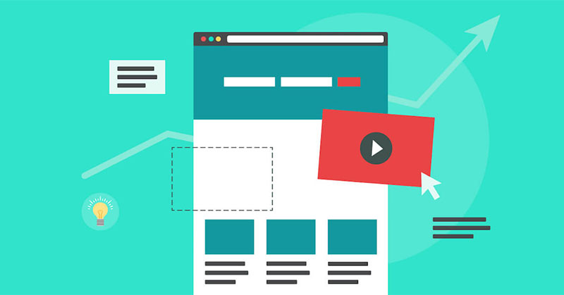
Essential Elements of a High-Converting Website
The difference between a website that attracts traffic and one that converts visitors into customers isn’t aesthetic—it’s psychological, structural, and technical. In 2026, conversion rate optimization has evolved from guesswork into a data-driven science where specific elements compound to create exponential improvements. Understanding these elements, backed by quantifiable research, separates thriving digital businesses from those that merely exist online.
The Conversion Mindset: Every Element Serves a Purpose
Before examining specific elements, the foundational principle: a high-converting website treats every pixel, word, and interaction as a conversion asset. There’s no room for decoration without function, no copy without purpose. This discipline extends from value proposition above the fold through to post-purchase email sequences. The best-converting websites aren’t necessarily the most beautiful—they’re the most intentional.
Research demonstrates the magnitude of impact: well-executed UX design increases conversions by up to 400%. A 2% improvement in conversion rate can double profits. Yet most sites operate at 2-3% average conversion, suggesting massive untapped potential. The companies capturing that potential obsess over optimization details that seem trivial in isolation but compound dramatically together.
1. Clear Value Proposition Above the Fold
Within 3-5 seconds of landing on your homepage, a visitor must immediately understand three things:
- What do you offer? (Product/service clarity)
- Who is it for? (Target audience relevance)
- Why choose you? (Differentiation from competitors)
This value proposition must appear above the fold—without scrolling—because 55% of visitors spend less than 15 seconds deciding whether to stay or leave. Your headline should be benefit-driven, not feature-focused. “Strategic digital marketing that drives real ROI” outperforms “We’re a full-service digital agency” because the first speaks to outcomes, the second to capability.
The worst positioning is vague or jargon-heavy copy that requires cognitive work to decode. “Leverage synergistic solutions to optimize your operational throughput” fails because it’s meaningless. Users abandon sites where they must interpret what’s being offered. Clear, direct language—especially using second-person (“you”) and benefit language—establishes relevance instantly.
Implementation: Test your headline against the “3-second rule.” Cover everything below your headline. Can a visitor who only reads the headline understand your core value? If not, rewrite.
2. Mobile-First Design (Not Desktop-First Responsiveness)
Mobile-first isn’t responsive design—it’s a fundamentally different design philosophy. Rather than building for desktop then squeezing onto mobile, modern conversion optimization starts with mobile’s constraint (5-inch viewport, touch interaction, limited attention) and expands thoughtfully to larger screens.
The numbers demand this prioritization: 62-67% of web traffic originates from mobile devices, and Google implemented 100% mobile-first indexing in July 2024. This means all ranking evaluations occur on mobile user agent, making desktop-only sites effectively invisible to search.
Mobile-first design improves conversions across devices through a counterintuitive mechanism: constraint forces clarity. When designing for 5 inches, you can’t include decorative elements or unclear copy. The ruthlessness required for mobile naturally creates focused, high-converting layouts that work even better on desktop.
Specific mobile optimization demands:
- Touch targets minimum 24×24 CSS pixels (not 18px, which frustrates users)
- Readable text without zooming (16px base font minimum, sufficient line-height)
- Fast mobile load times (<2 seconds for LCP target)
- Simple, accessible navigation (hamburger menu for clarity, not complexity)
- Mobile-optimized checkout (single-page, minimal fields, autofill enabled)
Mobile optimization also delivers unexpected SEO benefits: mobile-first design reduces file sizes by 30-50%, automatically improving load speed, which is a Google ranking factor.
Implementation: Use mobile-first CSS (design mobile in CSS, then use @media (min-width: 768px) to enhance for larger screens). Test on actual devices, not just browser emulation.
3. Fast Page Speed (Non-Negotiable)
Page speed directly correlates to conversions with stunning precision: a one-second delay in page load reduces conversions by approximately 7%. For an e-commerce site generating $1M in annual revenue, a 3-second load time instead of 1-second translates to approximately $210,000 in lost annual revenue.
Google’s Core Web Vitals—the three metrics determining search ranking and user experience quality—establish concrete targets:
- Largest Contentful Paint (LCP) < 2.5 seconds (how quickly the largest visible element renders)
- Interaction to Next Paint (INP) < 200ms (responsiveness to clicks and interactions)
- Cumulative Layout Shift (CLS) < 0.1 (visual stability as elements load)
Achieving these targets requires technical discipline:
- Image optimization: Serve WebP/AVIF formats (70% smaller than JPEG) with responsive sizing
- Lazy loading: Load below-fold content only when approaching viewport
- CDN deployment: Serve assets from servers geographically close to users
- JavaScript deferral: Load non-critical scripts asynchronously
- CSS optimization: Inline critical CSS, defer non-critical stylesheets
- Code splitting: Load only necessary code per page
Mobile-first design naturally supports speed through smaller viewport constraints. A properly optimized mobile site loads 30-50% faster than a desktop-first site redesigned for mobile.
Implementation: Use Google PageSpeed Insights and WebPageTest for measurement. Establish Core Web Vitals monitoring in Google Search Console. Set internal targets (e.g., <1.8s LCP, <100ms INP) and measure daily.
4. Trust Signals That Overcome Purchase Hesitation
Psychologically, visitors don’t convert unless they trust the business. Trust builds through social proof—evidence that others have purchased successfully and been satisfied. The most powerful trust signals:
Customer testimonials and reviews work best when they include real names, photos, and company affiliations. A testimonial reading “Sarah M. from acme.com: ‘Increased leads by 47% in 3 months'” outperforms generic praise because specificity signals authenticity. Video testimonials, where customers explain their results on camera, create even stronger trust.
Case studies with measurable results prove capability at scale. “Client X increased conversion rate from 2.1% to 3.4%, generating $150K additional annual revenue” establishes both competence and relevance. B2B companies especially benefit from detailed case studies showing problem-solution-outcome frameworks.
Industry certifications and security badges communicate expertise and safety. ISO certifications, industry-specific credentials (Certified Web Professional, Google Partner status), and security badges (SSL padlock, trust seals) reduce perceived risk.
Pricing transparency builds trust through honesty. Hidden costs are the #1 reason shoppers abandon carts. Displaying total cost before checkout, breaking down all fees (shipping, tax, processing), and offering clear refund policies reduce hesitation.
Security indicators matter especially for payment. Show SSL padlock, trust badges, and clear privacy policies next to sensitive form fields. Users need assurance that their payment information is protected.
Implementation: Add 3-5 prominent customer testimonials to homepage. Create a case study template with clear metrics. Add security badges to checkout. Test messaging like “Trusted by 50,000+ customers” or “95% customer satisfaction rating.”
5. Optimized Forms (The Conversion Friction Point)
Forms are conversion friction points where visitors abandon due to perceived effort. Research quantifies this precisely:
- Reducing form fields by one increases conversions by 11%
- Asking 50+ fields instead of 25 reduces completion by ~50%
- Contact forms have only 38% completion rate (lowest of all form types)
- Application forms achieve 75% completion rate (highest)
- Multi-step forms convert 86% higher than single-page forms
The counterintuitive finding: longer forms actually convert better when split into multi-step experiences. A 10-field form completing at 86% higher rate suggests that progressive disclosure (revealing fields strategically) feels less overwhelming than confronting all fields simultaneously.
Form optimization best practices:
- Reduce fields to 8 or fewer for initial forms. Ask for name, email, and 2-3 critical qualification questions only.
- Progressive profiling: Ask basic information initially (name, email), then additional details in stage-gate processes (company size, budget) only when genuinely needed.
- Multi-step forms: Present 2-3 fields per step, showing progress indicators. Users complete faster (86% higher conversion) and with less frustration.
- Inline field validation: Validate fields as users exit them, showing checkmarks or helpful error messages. Inline validation increases success by 22%.
- Clear labels above fields: “Create Password” is clearer than “Enter Password”—it reduces cognitive load. Labels above (not inside) input fields improve accessibility and usability.
- Optional vs. required clarity: Use asterisks (*) for required fields only. Making phone fields optional often doubles conversions.
- Autofill enabled: Let users enable autofill for addresses and billing information. Reduces entry friction dramatically, especially on mobile.
- Guest checkout option: Forcing account creation before purchase increases abandonment by 24%. Always offer guest checkout.
Implementation: Audit your longest form. Can you reduce fields by 2-3? Try multi-step version A/B tested against single-page. Measure completion rates by field to identify drop-off points.
6. Strong, Action-Oriented Call-to-Action (CTA)
A website can be beautiful and trustworthy yet still fail to convert if visitors don’t know what to do next. Call-to-action buttons must:
- Be visible without excessive scrolling (above the fold, or within 2 scroll positions)
- Use action-oriented language (“Get Started”, “Get a Free Quote in 2 Minutes”, “Start My Free Trial”, not “Submit” or “Learn More”)
- Explain the benefit (“Download Your Free SEO Audit” beats “Download PDF”)
- Contrast visually (bright color against background, drawing eye immediately)
- Have large touch targets (minimum 44×44 CSS pixels for mobile)
- Include multiple CTAs strategically (not just one, but placed logically throughout page)
Subtle copy changes have outsized impact: changing “Your” to “My” in button copy lifts clicks by up to 90%. This works because first-person language creates ownership—”My Quote” feels more personally relevant than “Your Quote.”
CTAs placed strategically throughout page (not just bottom) improve completion. A typical flow:
- Hero CTA (above fold): “Get Started Free”
- Feature CTA (after describing benefits): “See How It Works”
- Social proof CTA (after testimonials): “Join 10,000+ Users”
- Final CTA (before scroll end): “Start 14-Day Free Trial”
Implementation: Change CTA text from generic (“Submit”) to benefit-driven (“Get My Free Audit”). Increase button size to 44×44+ pixels. Test first-person language (“My”, “My Dashboard”, “My Results”) vs. second-person.
7. Visual Hierarchy Guiding Attention
Visual hierarchy directs user attention to the most important elements first. The eye naturally gravitates toward:
- Larger fonts (headlines command attention)
- Contrasting colors (CTAs pop against backgrounds)
- Strategic whitespace (empty space focuses attention on surrounding content)
- Motion and animation (movement draws eye)
High-converting sites use visual hierarchy to eliminate choice paralysis. Instead of equally emphasizing all elements, they create clear priority: primary CTA stands out in bright color, secondary options in muted tones. Headlines are bold and large; body copy is smaller and lighter.
Color psychology matters: high-contrast CTA buttons (bright green, red, or teal against neutral backgrounds) increase click-through rates. One study found converting to high-contrast CTAs increased conversions by 35%.
Implementation: Make your primary CTA 2-3x larger than secondary buttons. Use whitespace around important content. Test CTA color—bright contrasting colors typically outperform brand-matching colors.
8. High-Quality Product Content
For e-commerce and SaaS, product/service presentation directly impacts conversion. Best practices:
Vivid, detailed imagery:
- Multiple angles showing product from all sides
- Zoom functionality allowing detailed inspection
- Lifestyle photography showing product in use
- Videos demonstrating product features and benefits
- User-generated content (UGC) showing real customers using product
- Size comparison imagery (how large is this really?)
Benefit-focused descriptions (not feature lists):
- “Reduces back pain during 8-hour workdays” beats “Ergonomic lumbar support system”
- “Save 10 hours/week on scheduling” beats “Automated appointment booking”
- Address specific pain points, not just capabilities
Social proof and social signals:
- Star ratings with number of reviews
- Customer testimonials highlighting specific benefits
- “Top Sellers” or “Bestseller” badges creating FOMO
- “Recently Viewed” sections triggering familiarity
- “Customers Also Bought” recommendations for cross-sell
Comparative content:
- Alternatives shown (not hidden)
- Clear pricing comparison tables
- Feature-by-feature comparisons
- This transparency builds trust—you’re not hiding better competitor options
Implementation: Invest in professional product photography with multiple angles. Add zoom functionality. Write descriptions focusing on benefits and user outcomes, not specifications.
9. Transparent Pricing (The #1 Abandonment Preventer)
Hidden or surprise costs are the #1 reason shoppers abandon carts. Transparent pricing is conversion gold:
- Show final total clearly before checkout
- Break down all costs (product, shipping, tax, processing fees)
- Explain why costs are what they are (premium materials, overnight shipping)
- Show installed base cost if it’s compelling (“As low as $50/month”)
- Offer payment plans or BNPL options (Buy Now, Pay Later increases conversions 20-40%)
- Display return/refund policy clearly (reduces final anxiety)
Surprise costs destroy conversion. If a visitor adds a $30 product then discovers $15 shipping, they abandon. Price transparency from product page onward (showing estimated shipping, tax) reduces abandonment by ~25%.
Implementation: Show total price including shipping and tax at product page. Offer multiple payment methods (credit card, PayPal, Apple Pay, Google Pay, BNPL). Display clear return policy.
10. Frictionless Checkout Process
Checkout is where most conversions fail or succeed. Optimization here delivers outsized returns:
Single-page checkout vs. multi-page:
Multi-page checkout increases abandonment by 20%. Users see a 3-step checkout form and think “this is too long.” Single-page checkout with clear field groups (shipping, billing, payment) feels faster because progress is instant.
Minimal form fields:
Reduce to only essential information. Ask for name, email, phone, billing address, shipping address, payment—not “how did you hear about us?” or “what’s your job title?” (unless critical to business). Each additional field increases abandonment.
Guest checkout:
Forcing account creation increases abandonment by 24%. Always offer guest checkout. Collect email for future marketing—you can create an account later.
Progress indicators:
Show customers where they are (Step 1 of 3, Step 2 of 3) so they know how much remains. Prevents “I don’t know when this ends” abandonment.
Trust signals at final step:
This is where hesitation peaks. Show security badges, money-back guarantee, customer testimonial, and clear return policy. Reduce final friction with reassurance.
Multiple payment methods:
Credit card, PayPal, Apple Pay, Google Pay, BNPL options. Customers have preferences; limiting options drives abandonment.
Autofill enabled:
Let users autofill from browser or payment methods (Shop Pay, Apple Pay). Reduces friction by 80%+ vs. manual entry.
Clear error messages:
If validation fails, don’t show “Error 402.” Show “This zip code doesn’t match the state you selected. Did you mean 12345?” Help users fix errors, not guess.
Implementation: Test single-page vs. multi-step checkout. Measure abandonment by step. Add progress indicator. Enable autofill. Test checkout with 5 users—where do they hesitate?
11. Live Chat and Accessible Support
Sometimes a single question stands between visitor and conversion. Offering real-time support removes final hesitation:
Live chat benefits:
- Answers common questions immediately (no wait for email reply)
- Reduces cart abandonment by addressing concerns before checkout
- Increases average order value through real-time upselling
- Creates personal connection
AI chatbots handle routine questions (product specs, shipping times, return policy) while routing complex issues to humans. In 2026, conversational AI is standard expectation, not luxury feature.
Accessible alternatives:
- Prominent phone number
- Email contact form (easy to access)
- SMS support option
- Clear business hours and response time expectations
Implementation: Add live chat widget (tools like Intercom, Drift, Zendesk). Create FAQ section addressing top 10 questions. Enable chatbot for routine queries.
12. Psychological Triggers and Persuasion Elements
Human decision-making follows predictable patterns. Tapping into these psychological triggers dramatically increases conversion:
Scarcity and urgency: “Only 3 left in stock,” “Sale ends tomorrow,” “Limited-time offer” create anxiety-driven urgency. Users feel pressure to act now or lose opportunity. However, authenticity matters—false scarcity damages trust.
Social proof: “Join 50,000+ users,” “95% customer satisfaction,” customer testimonials. Humans are herd animals; seeing others’ success creates confidence. Social proof reduces perceived risk by 15-35%.
Authority: Displaying credentials, certifications, expert endorsements, media mentions builds credibility. Users trust sources they perceive as authoritative.
Reciprocity: Offering free value (free guide, free audit, free trial) creates psychological obligation to reciprocate. Users feel indebted and more likely to purchase.
Liking: Building genuine connection through relatable brand voice, authentic storytelling, and personality increases conversion by 30%. Users buy from people/brands they like.
Commitment and consistency: Small commitments lead to larger ones. A free trial user becomes more likely to convert because they’ve invested time. Consistency bias drives users to “follow through” on initial decisions.
Framing effect: How information is presented affects perception. “90% success rate” feels better than “10% failure rate” despite being identical. Positive framing increases perceived value.
Visual depiction effect: Users are more likely to purchase when visualizing themselves using the product. Lifestyle photography, user-generated content, and product demonstrations trigger this effect.
Implementation: Add “Only X left” indicators for inventory. Display customer count (“Join 50,000+ Users”). Create social proof sections with testimonials and case studies. Use positive framing in copy.
13. Personalization (The Modern Multiplier)
Personalized experiences increase conversions by 212%. Personalization uses user data to deliver relevant content and offers:
Dynamic content:
- Product recommendations based on browsing history
- Personalized homepage sections for returning visitors
- Location-specific messaging
- Device-specific optimization
Personalized landing pages:
Traffic from “Summer Sale Facebook Ad” lands on summer sale page, not homepage. Alignment between ad message and landing page increases conversion by 30-40%.
Behavioral segmentation:
- First-time visitors: emphasize brand trust and unique value
- Returning visitors: recommend popular categories based on past browsing
- High-value customers: exclusive products and early access
- Cart abandoners: retargeting with incentives
AI-powered personalization:
Analyze hundreds of signals (device, location, time of day, past behavior, similar users) to deliver personalized experience to each visitor.
Implementation: Enable product recommendation engine (most platforms have this). Create separate landing pages for major traffic sources. Use personalization platform (Optimizely, Dynamic Yield, HubSpot) for advanced segmentation.
14. Cart Abandonment Recovery
70% of shopping carts are abandoned—but many can be recovered. Recovery strategies:
Prevention first: Optimize checkout to prevent abandonment before it happens. Transparent pricing, single-page checkout, guest option, and security signals reduce abandonment rate.
Recovery tactics:
- Automated email sequence at 1 hour, 24 hours, 3 days after abandonment
- SMS notifications for urgent messaging
- Personalized discounts (“Complete your purchase, get 10% off”)
- Product recommendations (“You left these items in your cart”)
- Retargeting ads on Facebook/Google
- Push notifications for app users
AI-driven recovery:
Predictive analytics identify users likely to abandon before they do, enabling proactive intervention. AI determines optimal send time, offer amount, and channel for each user.
Multi-channel orchestration:
Modern recovery uses email, SMS, push notifications, and retargeting ads in coordinated sequence. Omnichannel approach reaches users in their preferred channels.
Personalization:
Recovery messages should reference specific items left in cart, with product images and exact pricing. “You left the blue running shoes in your cart—complete your order and get free shipping” outperforms generic “Complete your purchase.”
Implementation: Enable abandoned cart recovery in your platform (Shopify, WooCommerce, Magento all have built-in). Set up email sequence at 1hr, 24hr, 3 days. A/B test discount amounts (5%, 10%, 15%).
15. Continuous Testing and Measurement
High-converting websites aren’t built once—they’re continuously optimized. Implement systematic testing:
A/B testing:
- Test one element at a time (CTA color, button text, headline, form field count)
- Ensure sufficient traffic for statistical significance
- Measure against clear success metrics
- Document results for institutional knowledge
Multivariate testing:
- Test combinations of changes (multiple elements simultaneously)
- Useful when changes interact (button color + text, layout + CTA placement)
- Requires more traffic than A/B testing
Funnel analysis:
- Identify where users drop off (homepage → product → checkout → confirmation)
- Focus optimization on highest-drop-off stages
- Small improvements at major drop-off points compound
Metrics to track:
- Conversion rate by traffic source and device
- Form completion rate by field
- Bounce rate by page
- Cart abandonment rate
- Time to conversion
- Customer acquisition cost (CAC)
- Customer lifetime value (LTV)
Implementation: Use Google Analytics 4 for measurement. Set up conversion tracking for all key actions. Run one A/B test per month minimum. Document all results.
The Compound Effect
Individually, each element might improve conversions 5-15%. Combined, they create exponential impact. A website implementing all 15 elements properly could reasonably achieve 3-5x conversion improvement versus baseline.
The path to high-converting websites isn’t revelation—it’s systematic application of well-researched principles, tested rigorously against real user behavior, then continuously refined based on data. In 2026, this discipline separates thriving businesses from struggling ones.