Modern web design in 2026 has transcended trends to become a coherent philosophy rooted in three interconnected principles: human-centered design, balanced execution, and responsive vitality. Rather than chasing aesthetic novelties, contemporary websites share a disciplined approach where performance, accessibility, and emotional resonance converge. Understanding what makes a website feel modern requires examining the technical, visual, and psychological dimensions that define 2026 digital experience standards.
The Performance-First Foundation
Before any visual element renders, a modern website must meet a non-negotiable baseline: speed and technical reliability. Google’s integration of Core Web Vitals directly into its ranking algorithm has transformed performance from “best practice” into survival requirement. The three metrics define user experience quantitatively.
Largest Contentful Paint (LCP) measures loading performance—specifically, how long the largest visible element takes to appear. The target is under 2.5 seconds. In practical terms, this means optimizing server response times, implementing Content Delivery Networks (CDNs), and serving images in modern formats like WebP and AVIF with responsive sizing. A one-second delay in page load reduces conversions by approximately 7%, creating direct business pressure to optimize.
Interaction to Next Paint (INP) measures responsiveness—whether buttons click immediately or feel sluggish. This metric captures JavaScript execution efficiency and task breakdown, penalizing heavy third-party scripts and unoptimized event handlers. Modern sites break long JavaScript tasks into smaller chunks, defer non-critical scripts, and minimize DOM size to under 1,500 nodes.
Cumulative Layout Shift (CLS) measures visual stability. When elements move unexpectedly during page load—buttons shifting position, text reflow—users experience frustration and misclicks. Modern sites lock element dimensions, preload fonts explicitly, and avoid inserting content above the fold during loading.
These aren’t arcane technical metrics. They directly correlate with user behavior: faster sites keep visitors engaged, reduce bounce rates, and increase conversions. A modern website in 2026 achieves sub-2-second load times as table stakes, not achievement.
Mobile-First as Design Canvas, Not Afterthought
Mobile devices now generate 62-67% of global web traffic, yet many sites still follow a legacy desktop-first approach, then squeeze designs onto small screens. Modern design in 2026 inverts this: designers begin with the constraint of a 5-inch screen, then expand thoughtfully for larger viewports.
Google completed its migration to 100% mobile-first indexing on July 5, 2024, meaning all websites are crawled exclusively via mobile user agent. Desktop-only sites are effectively invisible to search engines. This algorithmic shift has made mobile-first a competitive requirement, not a design preference.
Mobile-first design produces unexpected benefits beyond mobile usability. By forcing designers to prioritize ruthlessly, mobile-first naturally improves loading speed by 30-50% through optimized code structure and reduced file sizes. The constraint becomes an asset. Touch-optimized design (24×24 CSS pixel targets, generous spacing) also improves desktop usability for users with dexterity challenges.
Modern sites employ flexible grid layouts using relative units (percentages, flex, CSS Grid) rather than fixed pixels, allowing content to reflow naturally across screen sizes without separate codebases. A single responsive codebase reduces maintenance costs and ensures consistency.
Visual Design: Warmth Within Simplicity
The era of stark minimalism—black text on white backgrounds, no personality—has evolved into warm minimalism and expressive minimalism. Modern design preserves the cognitive clarity of simplicity while reintroducing humanity through intentional details.
Glassmorphism has emerged as the dominant visual trend for 2026. This design approach layers translucent UI elements—cards, panels, buttons—over blurred backgrounds, creating a frosted glass effect. Glassmorphism works exceptionally well with dark mode, vibrant gradients, and data-heavy interfaces like dashboards because transparency reduces visual noise while maintaining clear separation between information layers. When paired with high-contrast typography, glassmorphism delivers the premium, high-tech aesthetic users associate with cutting-edge brands while maintaining accessibility and readability.
Organic shapes and anti-grid layouts represent a rebellion against a decade of rigid geometric precision. Instead of rectangular cards and grid-based sections, modern sites employ flowing curves, asymmetrical compositions, and wavy dividers inspired by natural forms. These shapes are not decoration—they establish visual hierarchy and guide the eye through content intuitively. Research shows organic shapes create more engaging visual paths than geometric grids because asymmetry naturally creates visual weight and focal points.
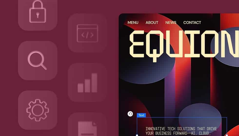
Bold typography has moved from functional legibility to primary design element. Oversized headlines—often 48px or larger—command attention without additional decoration. Custom fonts, gradient text, layered typography, and kinetic animations on scroll make type itself the story. This approach aligns with the shift from image-heavy design to narrative-driven design where words carry emotional weight.
Color palettes in modern design remain strategically limited but emotionally warm. Rather than stark black-and-white, sites use dark grays (#0D1117 like GitHub), paired with cream and beige accents. Limited color palettes reduce cognitive load while soft, natural tones (earth browns, sage greens, dusty roses) convey authenticity rather than corporate coldness. Gradients add depth and movement without visual chaos.
Interactive Elements That Feel Alive
A website can be visually modern yet feel dead if interactions are absent or clunky. Modern sites employ micro-interactions—small, purposeful animations that confirm actions and guide attention. When a user hovers a button, it subtly expands or changes color, confirming it’s interactive. Form fields validate with animated checkmarks. Loading states show progress with animated spinners or skeleton screens. Each micro-interaction answers a question (“Is this clickable?”) or reduces friction (“What’s happening?”).
The key distinction: micro-interactions serve UX, never decoration. A pointless animation that wastes bandwidth or slows interaction to next paint is anti-modern, no matter how stylish.
Scroll-triggered animations and parallax effects add layered storytelling. As users scroll, new elements fade in, text slides on screen, or background imagery shifts at different rates than foreground content. This technique—called “scrollytelling”—makes the scroll action itself part of the narrative, keeping users engaged throughout the page.
3D and immersive elements have become technically feasible for mainstream sites through WebGL and Three.js libraries. Product pages might feature rotating 3D models, allowing users to inspect items from all angles. Dashboard visualizations use subtle 3D depth. The key is restraint: 3D serves function (showing product detail, visualizing data) rather than existing purely for wow factor, which would tank Core Web Vitals.
Conversational interfaces powered by AI represent a fundamental shift in how users navigate sites. Rather than traditional navigation menus, increasingly sites embed AI chatbots at the center of the experience. These aren’t rigid FAQ bots matching keywords to canned responses—they employ natural language processing to understand context, remember conversation history, and guide users through multi-step processes. Modern conversational UI includes typing indicators, suggested questions, visual infographics within chat, and clear CTAs that feel like conversation partners, not help widgets.
Accessibility as Foundational, Not Afterthought
Modern sites don’t retrofit accessibility; it’s embedded in foundational design decisions. Dark mode exemplifies this shift. Once a cosmetic preference, dark mode now serves accessibility and well-being. Users with light sensitivity, neurodivergent conditions, or those working in low-light environments report significantly reduced eye strain with properly designed dark interfaces. Dark mode also reduces battery drain on OLED screens and can reduce bounce rates by up to 70%.
However, dark mode accessibility demands intentionality. Simply inverting colors fails WCAG contrast standards and creates illegibility. Modern dark mode design uses dark gray backgrounds (#0D1117, not pure black #000000) paired with light gray text (#C9D1D9), tested against accessibility checker tools like WebAIM. Users should have a toggle to choose light or dark mode based on their needs, with preference persisted via localStorage.
Beyond dark mode, modern design embeds accessibility throughout: semantic HTML tags (<header>, <nav>, <main>) assist screen readers; color contrast ratios exceed WCAG AA standards; focus indicators are clearly visible; form labels accompany inputs rather than placeholder-only fields; touch targets are at least 24×24 CSS pixels; motion respects prefers-reduced-motion preference.
This accessibility-first approach isn’t burden—it’s aligned with universal design principles that improve usability for everyone. Generous spacing between interactive elements helps users with motor impairments and also improves visual clarity for all users. Clear color contrast helps color-blind users and also makes designs more readable on varying screen qualities.
AI-Driven Personalization Without Deception
Artificial intelligence in 2026 web design has moved beyond chatbots into personalization architecture. Modern sites analyze real-time user data—browsing history, on-site interactions, device type, time of day—to adapt layouts, content visibility, and navigation dynamically. Visitors to an e-commerce site might see product recommendations based on past browsing; readers might see editorial sections curated to their interests; software dashboard visitors see role-specific interfaces.
Agentic AI—autonomous systems that take actions—represents the cutting edge. Rather than answering questions reactively, agentic chatbots proactively guide users through multi-step tasks: booking appointments, updating preferences, executing transactions. According to Figma’s 2025 research, 51% of designers working on AI products are now building agents, up from 21% the prior year. This acceleration reflects mainstream adoption.
The ethical dimension matters: modern sites pair AI personalization with clear privacy labeling, transparent consent models, and respectful engagement practices that don’t employ dark patterns (deceptive UX designed to manipulate).
Performance vs. Visual Richness: False Dichotomy Dissolved
A persistent myth claims high-visual-impact design sacrifices performance. Modern sites prove this false. Stripe’s homepage features flowing organic gradients, glassmorphic elements, and immersive imagery while maintaining near-2-second load times through aggressive asset optimization. The balance isn’t compromise—it’s orchestration. High-resolution hero imagery is served in WebP format with responsive sizing. Heavy 3D visualizations load asynchronously, never blocking initial paint. Third-party scripts load deferred, never render-blocking. The result: visually rich sites that feel instant.
Real-World Examples of Modern Design
The most instructive examples demonstrate how these principles integrate.
GitHub’s Mona Sans Website features a cinematic hero section with massive, stacked typography rendered in 3D with gradient lighting effects, yet the site remains highly performant through careful image optimization and deferred asset loading. The bold type establishes instant visual impact; the 3D effect conveys technological sophistication; responsive layout ensures the cinematic effect works on mobile too.
Lusion represents the pinnacle of immersive design. High-end 3D visuals, real-time interactive elements, fluid animations—yet the site loads fast by leveraging WebGL efficiently and lazy-loading heavy assets. The minimalist UI (soft gray background, black typography) ensures 3D complexity never overwhelms; clean navigation keeps the immersive experience purposeful, not chaotic.
Stripe employs organic shapes, flowing gradients, and asymmetrical layouts that would look chaotic without disciplined spacing and clear visual hierarchy. The design feels human and warm despite being high-tech, achieved through generous whitespace, soft color gradients replacing harsh contrast, and subtle animations that guide rather than distract.
Apple’s Product Pages represent minimalism done correctly. Massive product imagery dominates; whitespace breathes; typography is bold and generous; a single primary call-to-action is impossible to miss. The design trusts the product to speak; visual noise would dilute that message. Mobile versions eliminate non-essential information entirely, forcing ruthless prioritization.
| Design Characteristic | Why It Matters in 2026 | Modern Execution |
|---|---|---|
| Sub-2-second load times | Ranking factor + 7% per second conversion impact | WebP images, CDN, deferred JS, optimized code |
| Mobile-first design | 64% of traffic is mobile; Google 100% mobile indexing | Design for 5-inch screens first, expand for larger |
| Accessibility standard | Legal requirement + universal design improves all UX | WCAG compliance, dark mode, semantic HTML |
| Glassmorphism/Organic shapes | Creates visual sophistication without clutter | Frosted glass effects, flowing curves, asymmetry |
| Bold typography | Conveys personality and brand identity | Oversized headlines, custom fonts, kinetic type |
| Purposeful micro-interactions | Confirms responsiveness, guides attention | Hover effects, scroll animations, validated forms |
| AI personalization | Increases relevance and engagement | Real-time content adaptation, conversational UI |
| Warm color palettes | Emotional resonance vs. sterile appearance | Natural tones, gradients, high contrast for readability |
The Philosophy: Intentionality Over Trends
What unites modern websites isn’t aesthetic style—glassmorphism vs. neumorphism, organic shapes vs. grids, dark mode vs. light—but rather intentionality. Modern design rejects the notion that every element exists because it “looks cool.” Instead, every visual detail, animation, color, and interaction serves either performance, usability, or emotional resonance. Often all three simultaneously.
A modern site in 2026 asks: Does this animation serve a purpose or waste bandwidth? Does this color choice meet accessibility standards? Does this layout serve users on mobile or force them to pinch and zoom? Does this copy speak authentically or regurgitate corporate jargon? Does this interaction delight or deceive?
The sites that feel most modern aren’t necessarily the boldest or most experimental. They’re the ones where design decisions compound: fast loading enables visual richness; mobile-first focus creates intuitive navigation; accessibility standards improve clarity for everyone; intentional micro-interactions delight without slowing; warm color palettes create emotional connection that harsh minimalism wouldn’t. The effect is cohesion—the sense that every choice was deliberate and every detail matters.
Modern web design in 2026 has matured beyond trend-chasing toward a design ethics where performance, accessibility, beauty, and authenticity reinforce rather than compete. Websites that achieve this balance don’t just look contemporary—they feel alive, trustworthy, and built for humans, not algorithms.